APR 2022 - JUN 2022
SYDNEY, NSW
Spiral.io Web Design & Development
DESCRIPTION
Spiral.io is a study tool developed specifically for programming and computer science students, designed to maximize coding productivity and minimize burnout.
The website is a composite of planning and content tools iteratively designed after thorough user research and competitive analysis.
After crafting a development pitch, I spent several weeks implementing a functional prototype using HTML, Sass, and Node.js runtime environment.
🡵 GitHub Repo
PROJECT TYPE
University Project
PROJECT ROLE
TOOLKIT
Design Brief
PROJECT OBJECTIVE
The overall assessment required me to design and prototype a web application to help students manage their study sessions. My initial task involved researching and identifying which subgroup of this demographic I thought could benefit the most from such a tool.
I would then need to conduct the necessary research concerning my target audience, and construct a proposal pitch consisting of relevant user personas and service mockups.
FUNCTIONAL SPECIFICATIONS
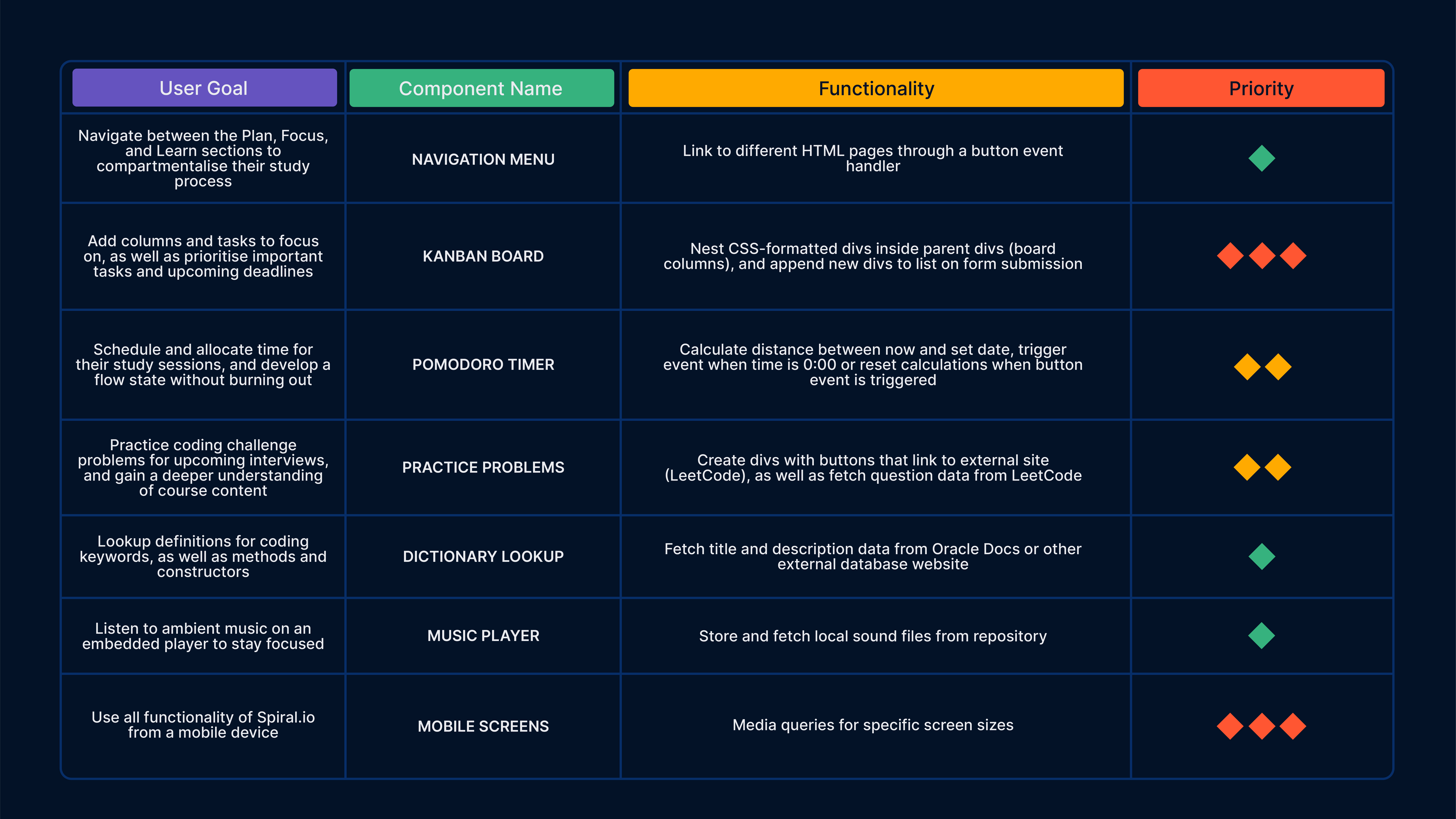
The functional requirements for the design brief were dictated by a competitive analysis of existing study services, which identified task, time, and content management tools as key ingredients. Thus, the feature requirements were split into three main components:
TASK MANAGEMENT
Kanban Board
Users should be able to enter individual tasks, along with the due date and priority. They should also be able to add and arrange tasks and columns in the kanban board.
TIME MANAGEMENT
Pomodoro Timer
Users should be able to start, stop, and reset the timer. They should also be able to edit the default session and break times.
CONTENT MANAGEMENT
Dictionary Lookup
Users should be able to lookup definitions of words from an online API, as well as see suggested synonyms of the word they looked up.
User Research
TARGET AUDIENCE
Having prior interest and experience within the realm of computer science, I selected programming and software engineering students as my target audience for the study platform.
As a former Computer Science student at the University of Berkeley, California, I was aware of the courseload's rigor, and hypothesized that a tailored digital service could dramatically improve study habits and course marks for overwhelmed students.
USER PERSONAS
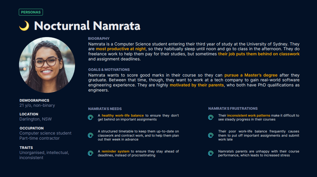
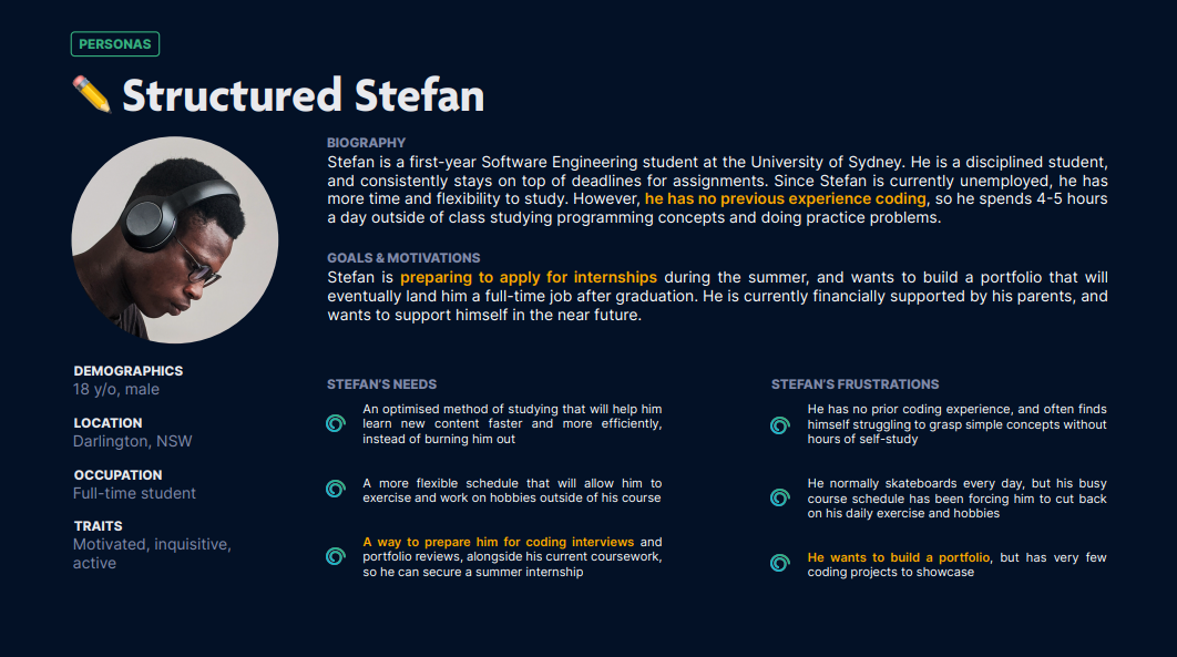
I conducted relevant secondary research and performed an online ethnography involving student learning patterns, coding productivity tools, and user frustrations. From there, I constructed several personas to identify current user goals, motivations, and frustrations.
Research Insights
🎯
PROBLEM STATEMENT
The rigor of computer science and software engineering courses, paired with external commitments, leads to chronic
burnout and inconsistency within university students looking to graduate and get hired.
👑
VISION STATEMENT
Spiral.io aims to address this issue by creating a study structure to encourage consistent and manageable course
progress, as well as providing daily supplementary challenges and practice material.
KEY TAKEAWAYS
Some insights unique to programming students include habitually nocturnal study patterns, chronic burnout, and frequent access to digital resources.
1
Programming students are most active at night, because of course workloads and part-time jobs
2
Students spend anywhere from 4-10 hours a day in classes and studying, which often leads to chronic burnout
3
Students habitually use online resources (StackOverflow, GitHub, LeetCode) to help them study
4
Students primary goals are to build a coding portfolio and have a job offer by the time they graduate
Development Proposal Video
Design & Iteration
CONCEPT SKETCHES
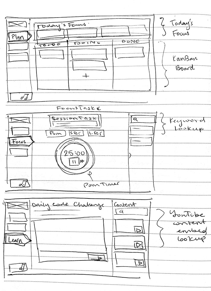
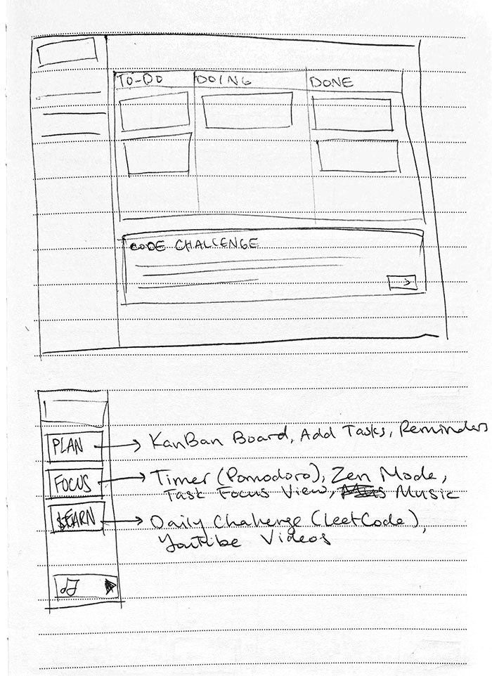
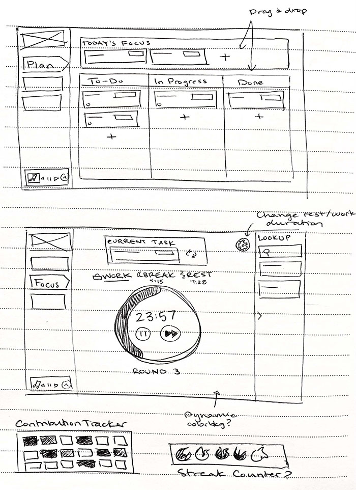
I decided to separate the website content into three work sections (“Plan”, “Focus”, “Learn”), to allow for mental compartmentalisation of study structure.
I added categories to the Kanban board for task grouping between classes, and also added a "Today's Focus" section to encourage pointedness and pre-study task planning, while avoiding overexertion.
VISUAL & COLOR EXPLORATION
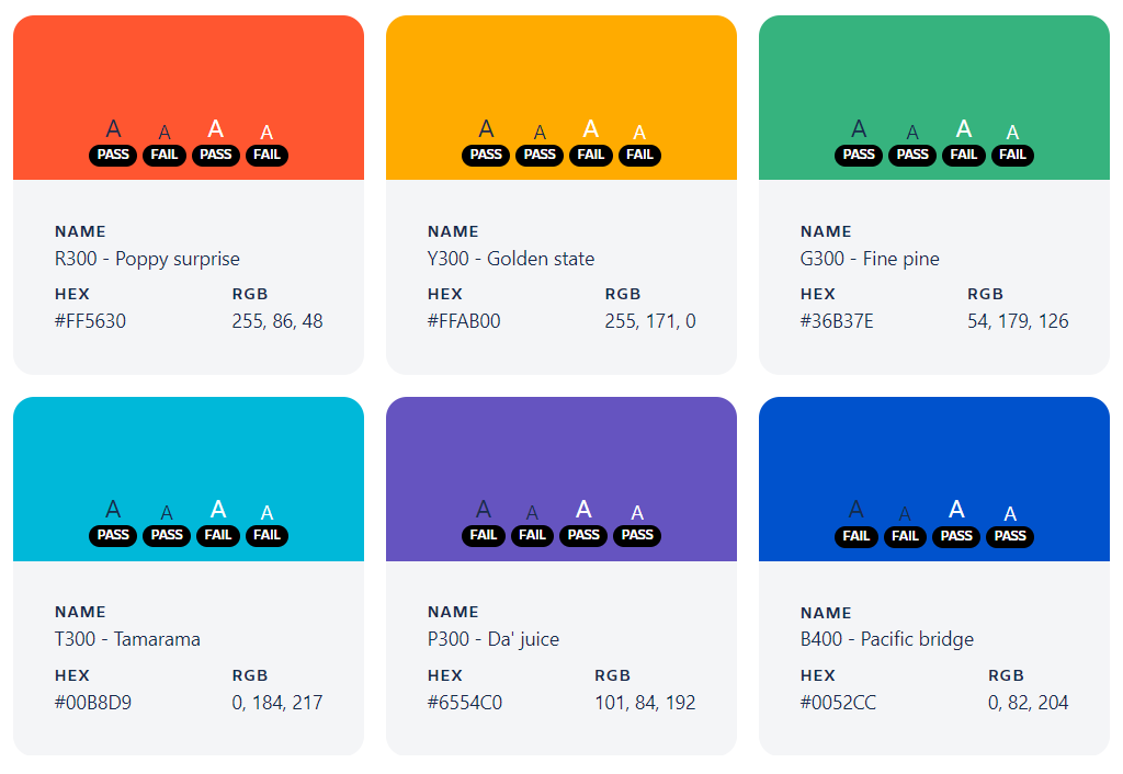
I used the color palette from the Atlassian Design System to ensure visual accessibility and researched color psychology.
I also chose to re-use familiar component styles and visuals from popular coding services that students mentioned in my online ethnography (e.g. GitHub, VSCode, LeetCode).
Since the majority of students would either be learning or working on these platforms, utilising a similar visual style would allow students to feel more comfortable in the Spiral.io environment,
as well as mentally compartmentalise their work.
Based on my research, I also decided on a dark palette to reduce eye strain for nocturnal developers, and an off-black base to avoid high contrast.
Mockups
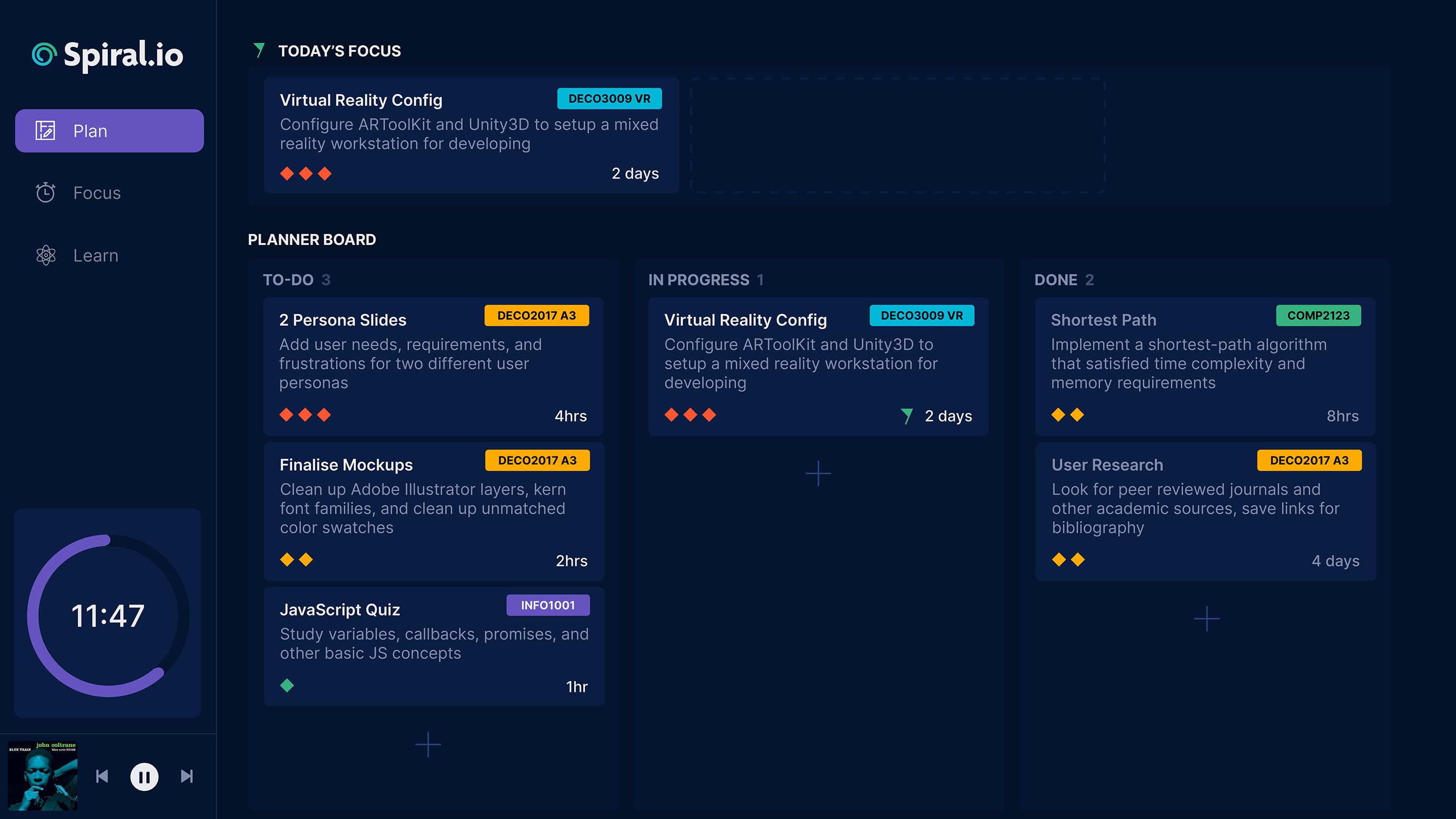
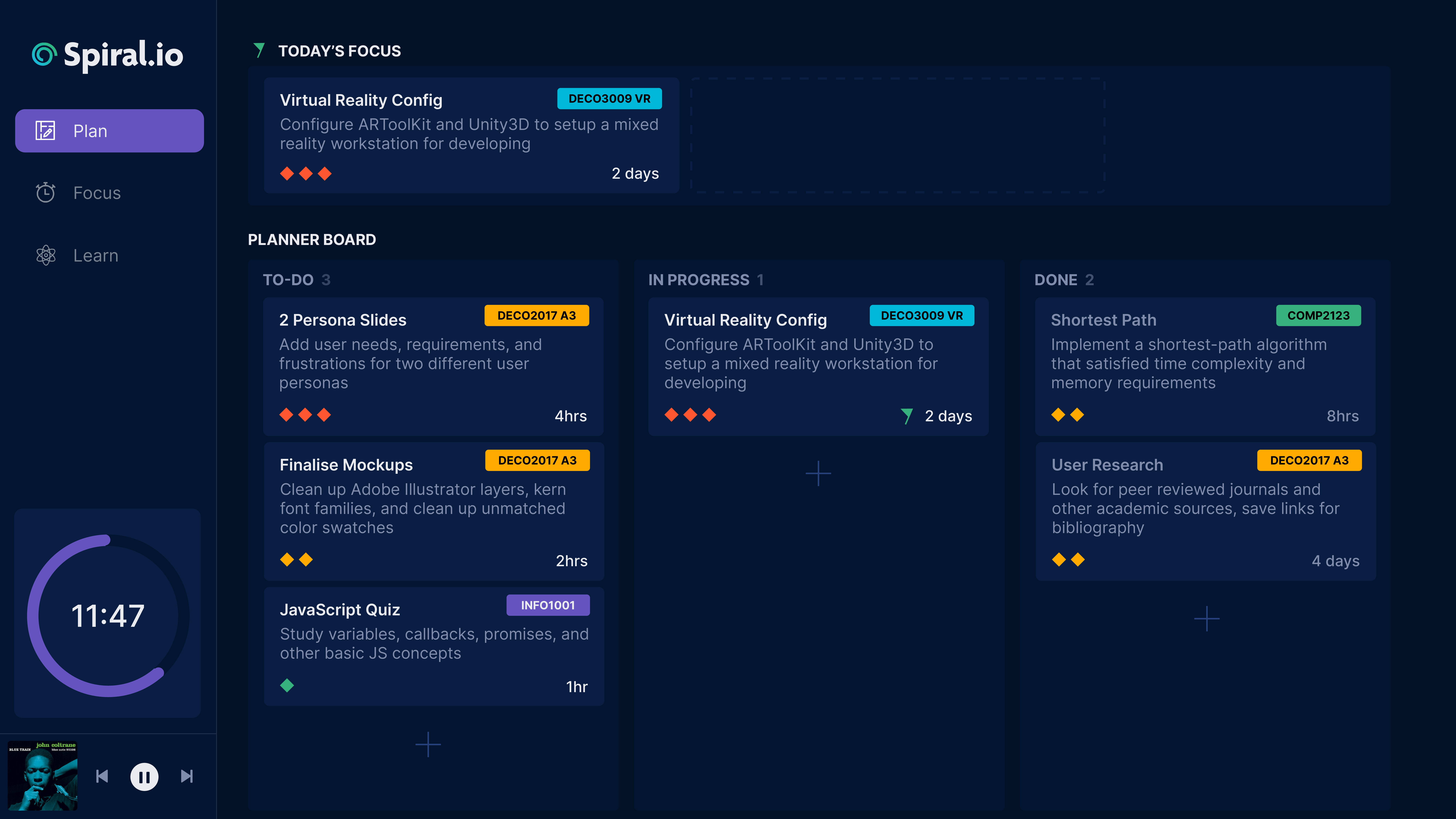
The "Plan" homepage for the website, with a Kanban Board. Any tasks dragged into the "Today's Focus" board will be added to the "Focus" section to keep the user focused on a small number of scheduled tasks.
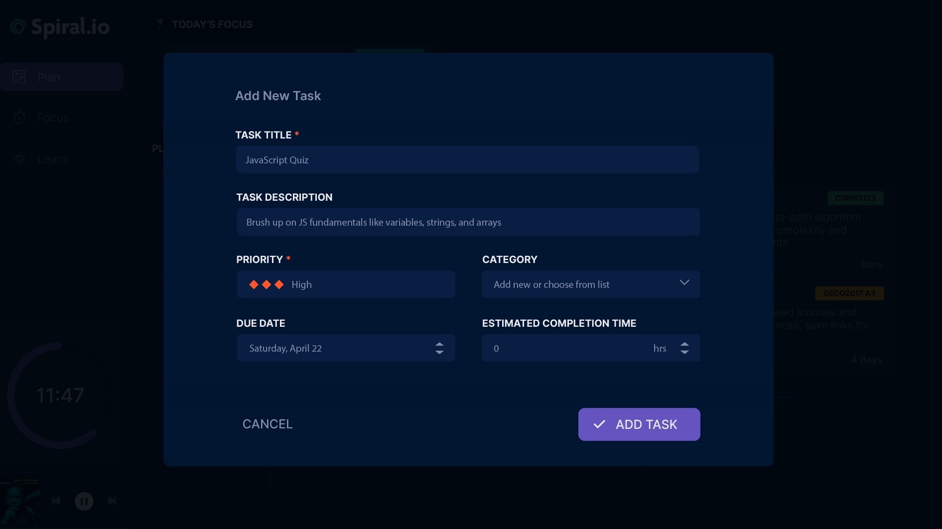
The popup modal interface for adding tasks to the Kanban Board. Users can add task categories, priorities, time commitment expectations, and due dates.
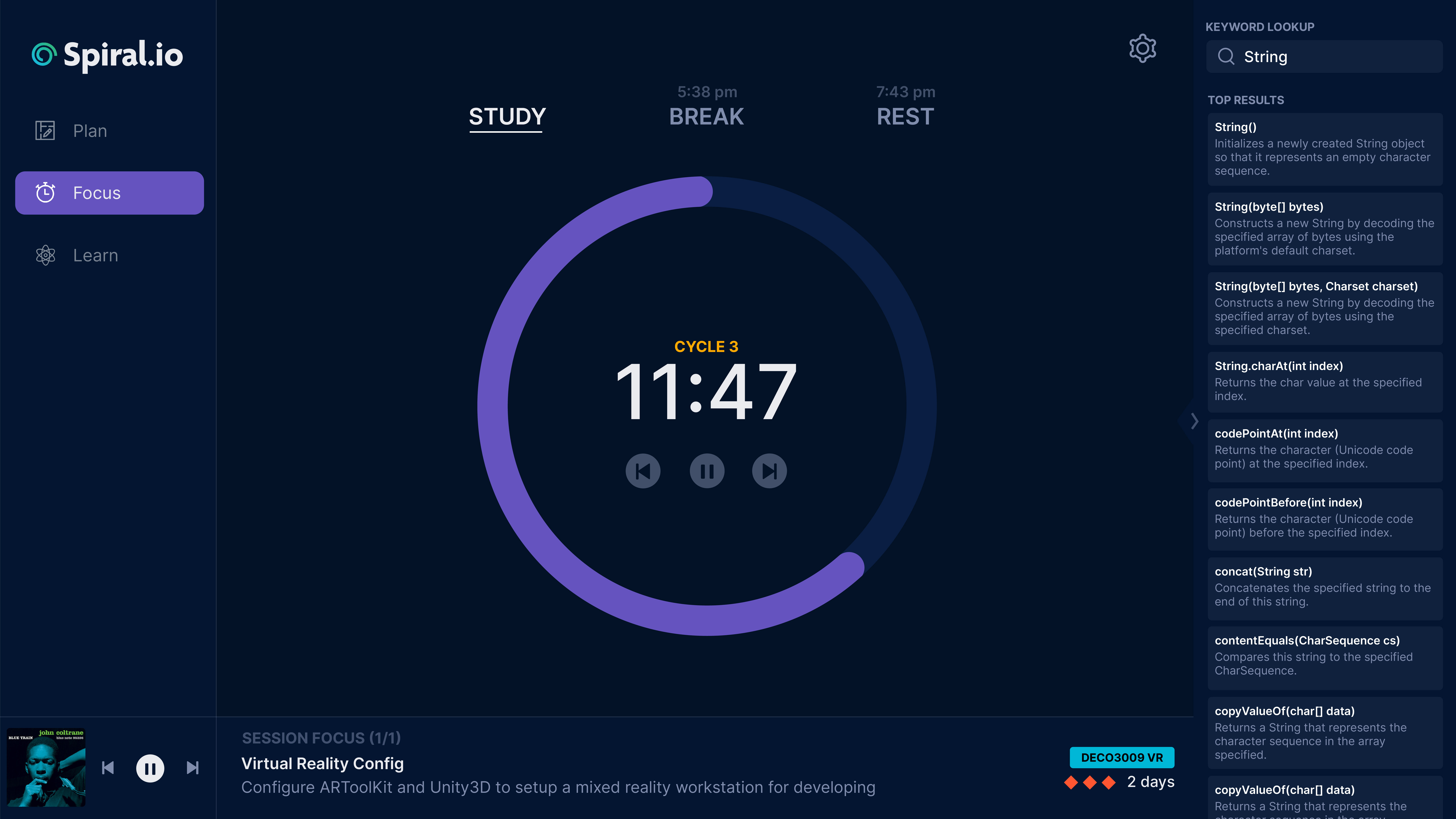
The "Focus" section, with a Pomodoro Timer. There is an embedded keyword dictionary to lookup coding methods, to minimise time spent browsing the web. Users can set and change session times, as well as see tasks from "Today's Focus".
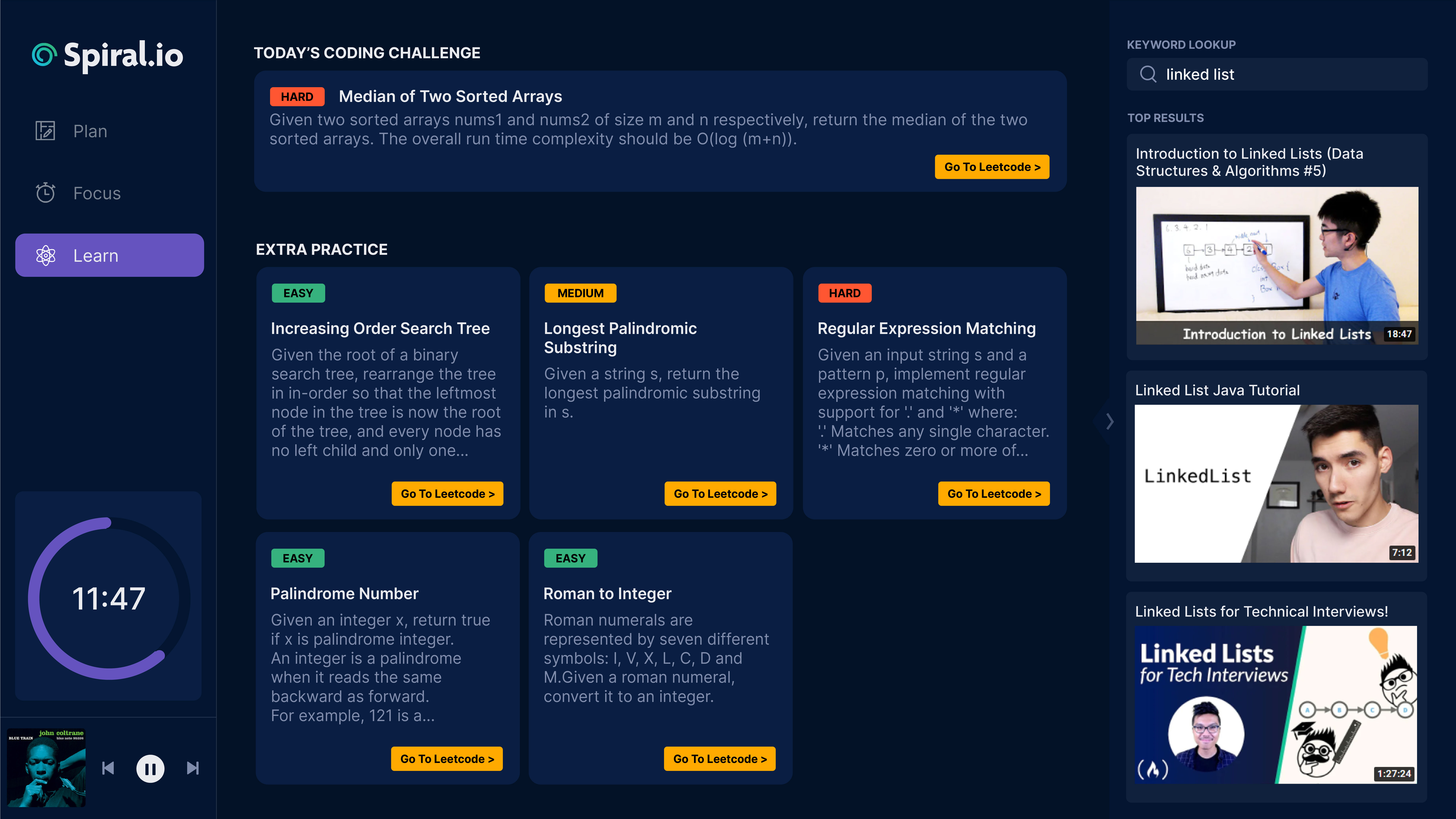
The "Learn" section, with daily programming challenges that are sourced from Leetcode. There is also an embedded search tool to find YouTube tutorials for coding concepts.
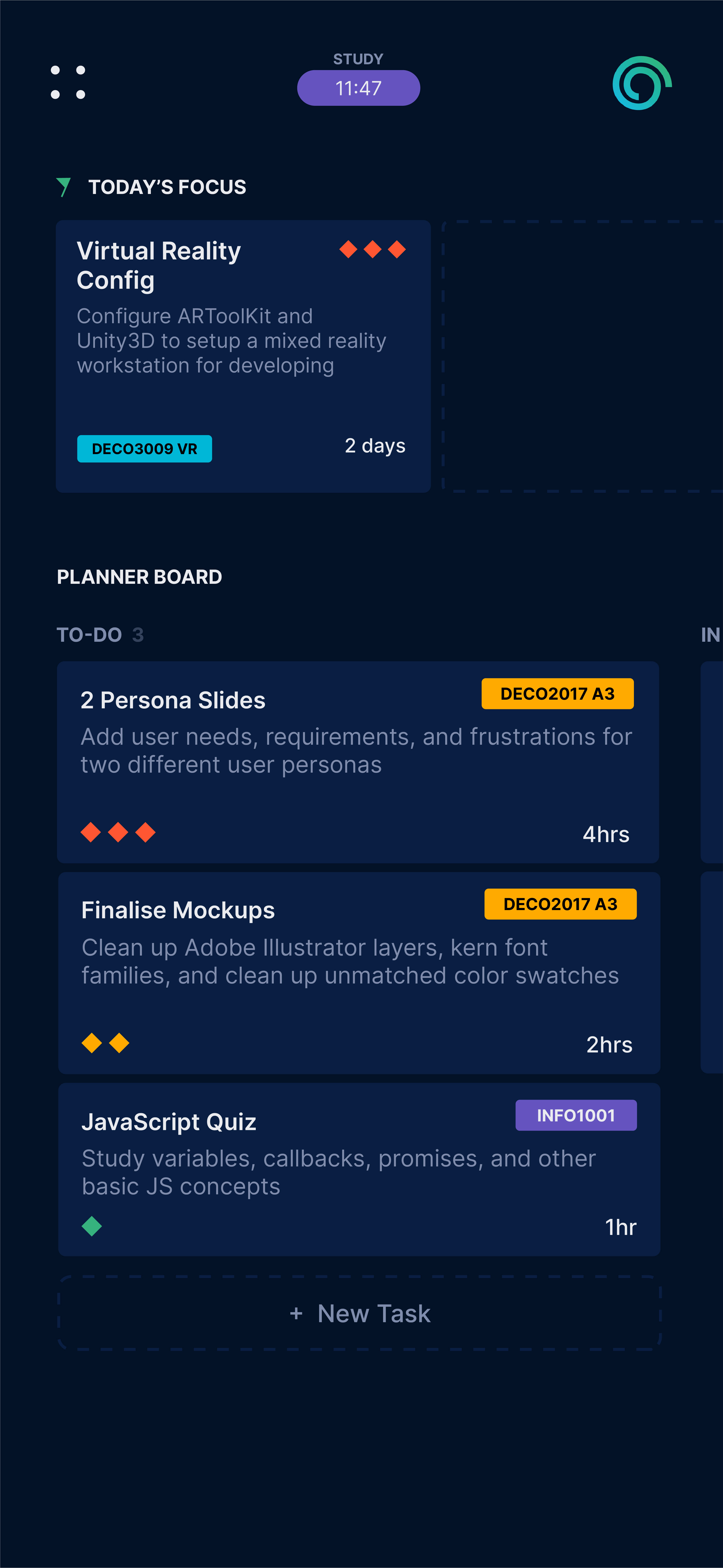
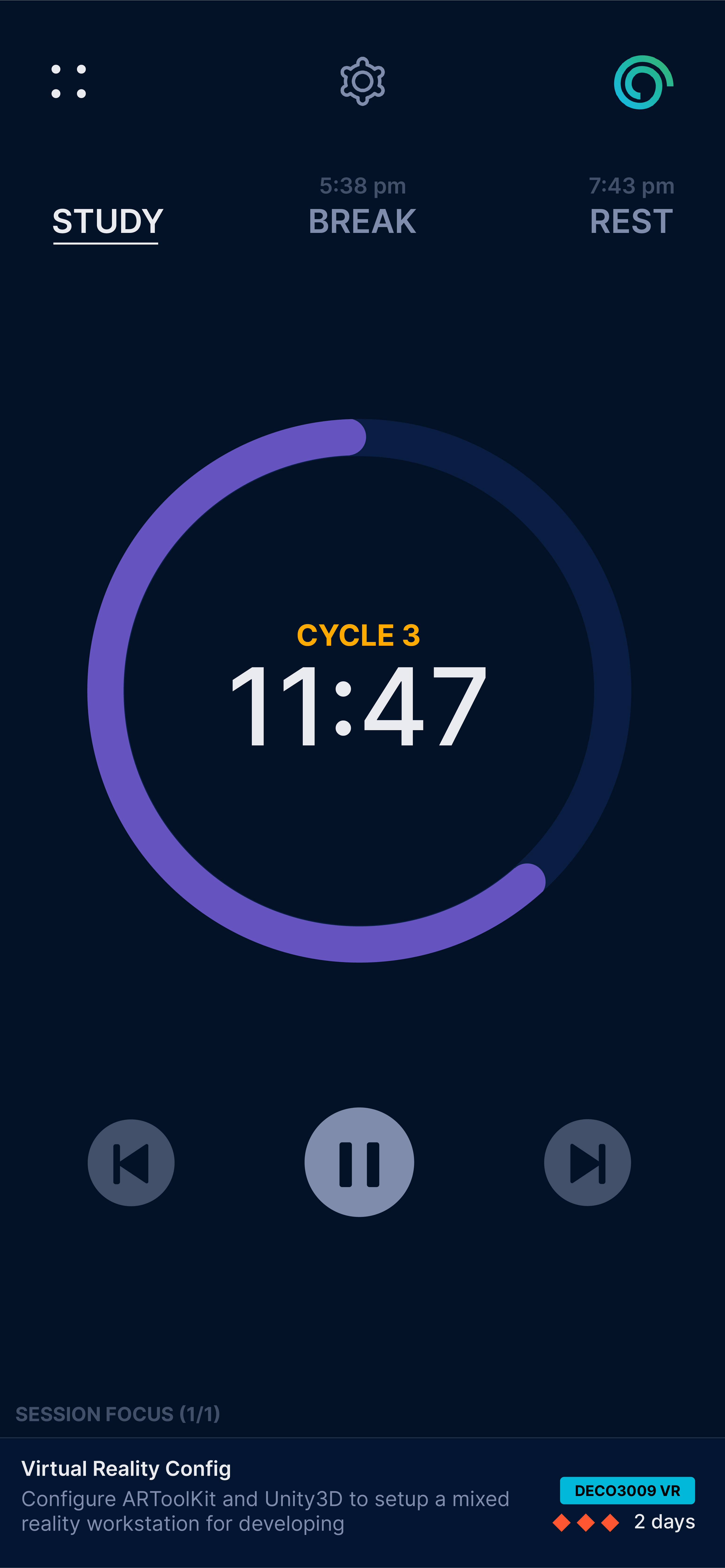
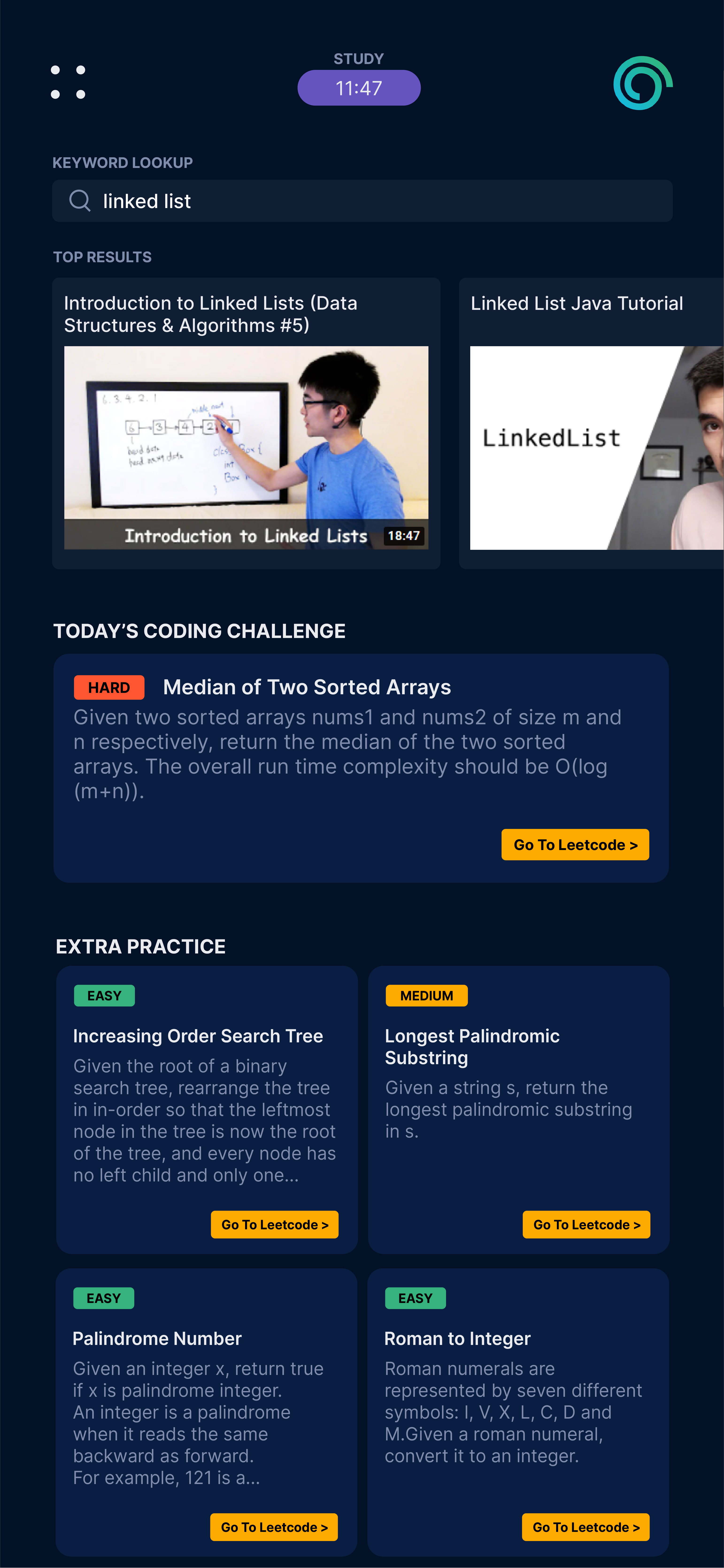
Mobile screen mockups for the "Plan", "Focus", and "Learn" sections.
Website Development
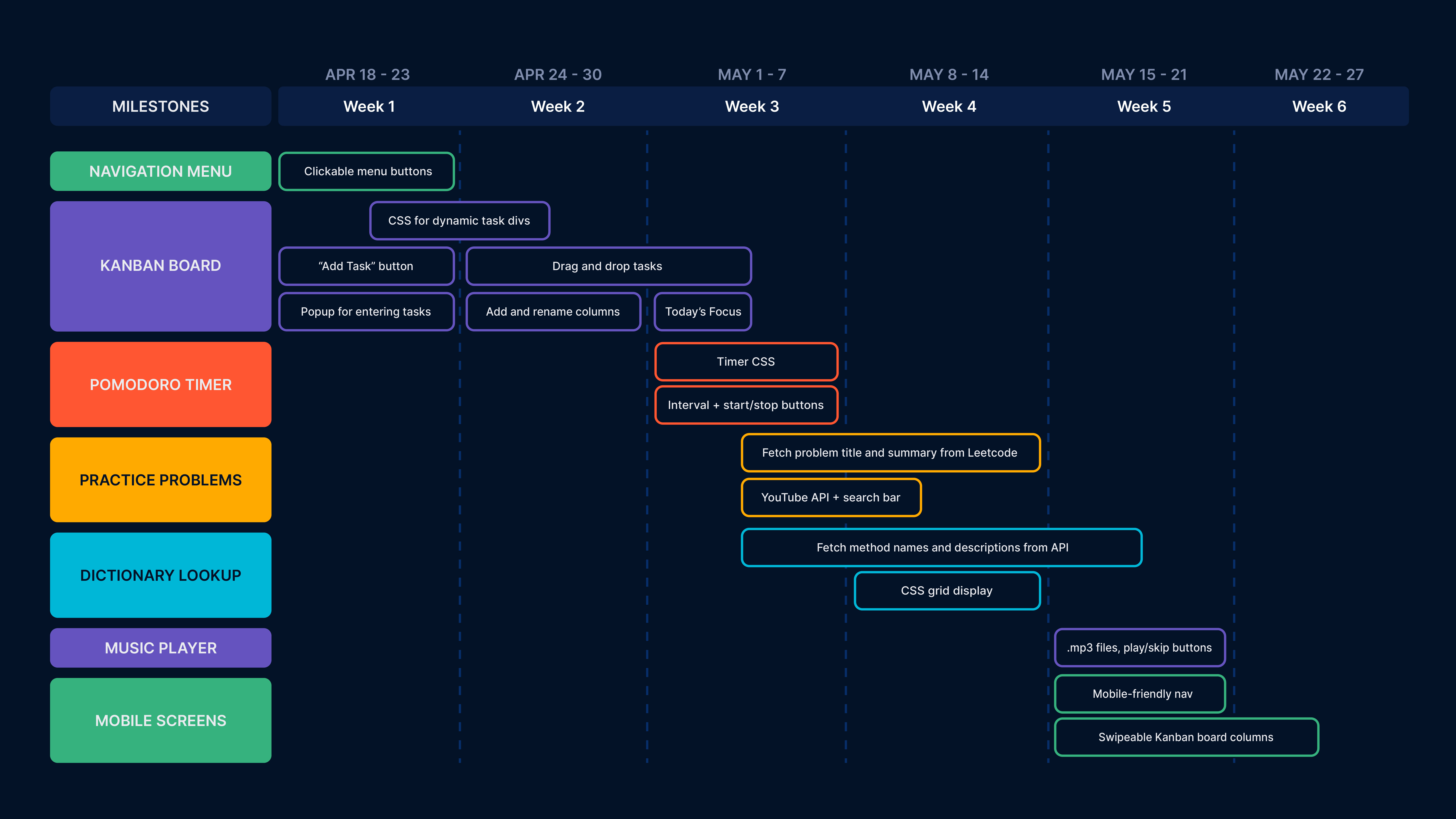
DEVELOPMENT ROADMAP
After submitting my pitch and receiving a High Distinction (A+ American equivalent) mark from the teaching team,
I was able to move to the development phase of the website.
I created a development roadmap for myself to allocate time blocks for high-priority items, and push less relevant site features to
the end of the timeline.
I chose not to utilise any third-party libraries for the project, as a personal learning challenge for myself, so I prioritised the development
of a vanilla Kanban Board and Pomodoro Timer.
KANBAN BOARD IMPLEMENTATION
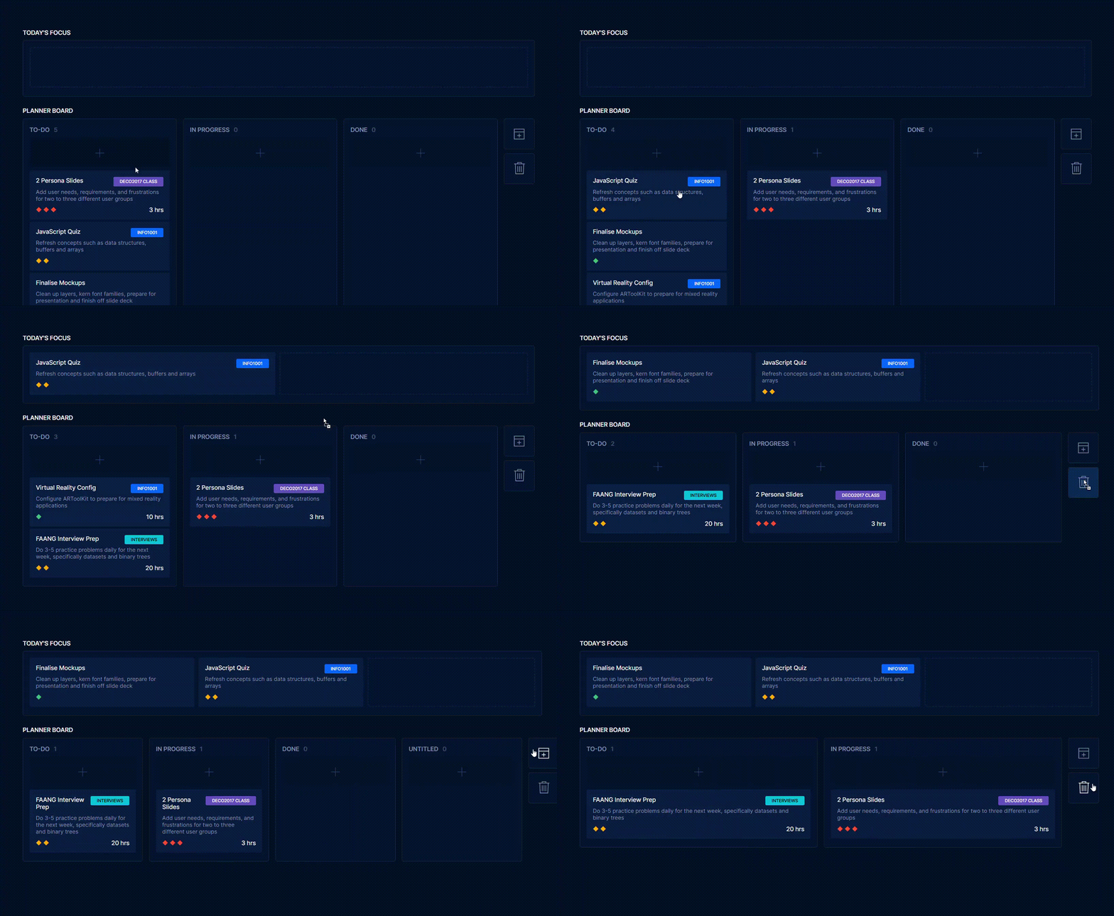
Implementing the drag-and-drop functionality for the board was done by creating a task object and appending each one to its respective parent board. Defining a valid drop-zone as a parent with "kanban-board" class
ensured that no illegal drops were accepted, and also allowed for hover state interactivity.
A big challenge I had was color-coding category labels, as I wanted categories with the same name to be the same color. To implement this, I had to create a new category object and validate each name during my addTask() function.
For each unique label, I appended a programmatically-calculated label color to the category object, so any future category with the same name would reference that same color label.
Interaction patterns for dragging between columns, deleting tasks, and adding/removing boards. Note that the "Delete" button functions as a multi-purpose node for deleting boards and tasks.
POMODORO TIMER IMPLEMENTATION
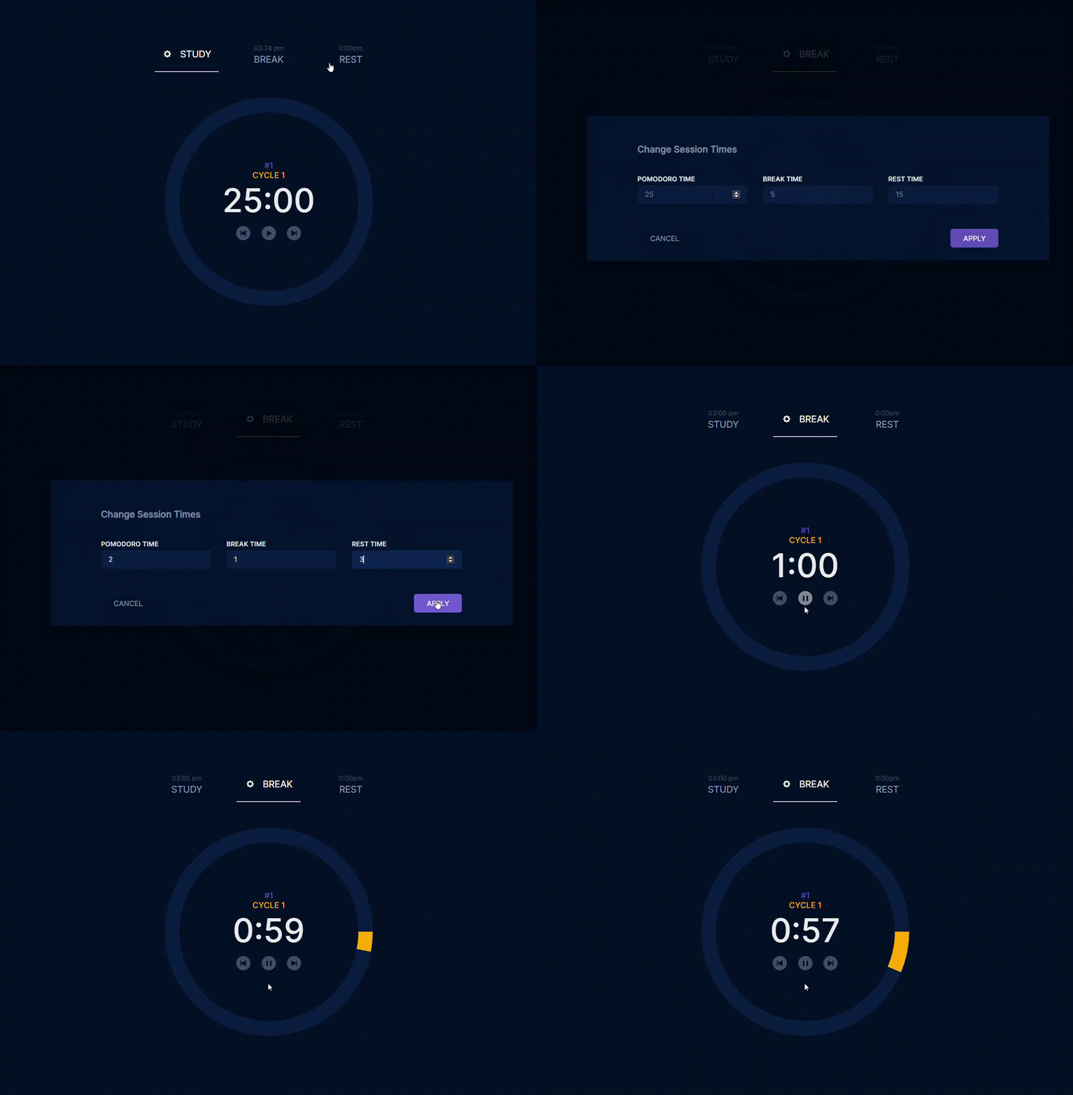
The timer was also tough to make responsive, as changing the element size itself broke the precise padding for the stroke-dasharray calculations I had made.
After much tinkering, I decided the best way to ensure nothing broke was to dynamically calculate the timer padding proportionally to the screen width, and retain the actual size of the timer itself.
As for the dictionary, I implemented it stylistically the way I had intended, however after much online research I failed to find an API for coding keywords that was free and worked the way I intended.
Ideally, I would have liked an API that had definitions for popular methods and functions for frontend languages, but this didn't seem to exist yet. So instead, I opted for a normal dictionary API.
Setting custom session times for the Pomodoro Timer, and demonstrating a play state. When the session is complete, the Pomodoro Timer cycles to the next study/break/rest, and increments the count. Note the "next times" on the headings are not fully implemented.
Modifications & Final Thoughts
Some site components underwent several minor changes between the mockup and final design process, some of which included:
Embedding a Spotify music player ensured fast site load times as opposed to a vanilla music player. I originally had implemented a simple music player without the use of an external iframe, but wanted to include a variety of tracks so users wouldn't get annoyed by the repetition. This would have been problematic to implement without Spotify, as the repository wouldn't have been as lightweight.
Cross-page support for the "Today's Focus" items wasn't implemented as I ran out of time and wanted to focus on more essential aspects of the site instead. In the future, I think this would be a valuable feature to implement, as it helps with focus during longer study sessions.
Excluding the "Learn" section was the biggest decision I made for my site. The actual functionality of the section simply linked to external resources, and if users wanted to use those websites, they would likely just navigate to the page on the internet themselves
The features weren't an integral part of the design brief, and I wanted to focus on polishing more important parts of the website first.
Cross-page support for the "Today's Focus" items wasn't implemented as I ran out of time and wanted to focus on more essential aspects of the site instead. In the future, I think this would be a valuable feature to implement, as it helps with focus during longer study sessions.
Excluding the "Learn" section was the biggest decision I made for my site. The actual functionality of the section simply linked to external resources, and if users wanted to use those websites, they would likely just navigate to the page on the internet themselves The features weren't an integral part of the design brief, and I wanted to focus on polishing more important parts of the website first.

